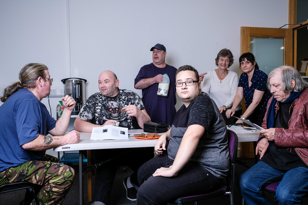
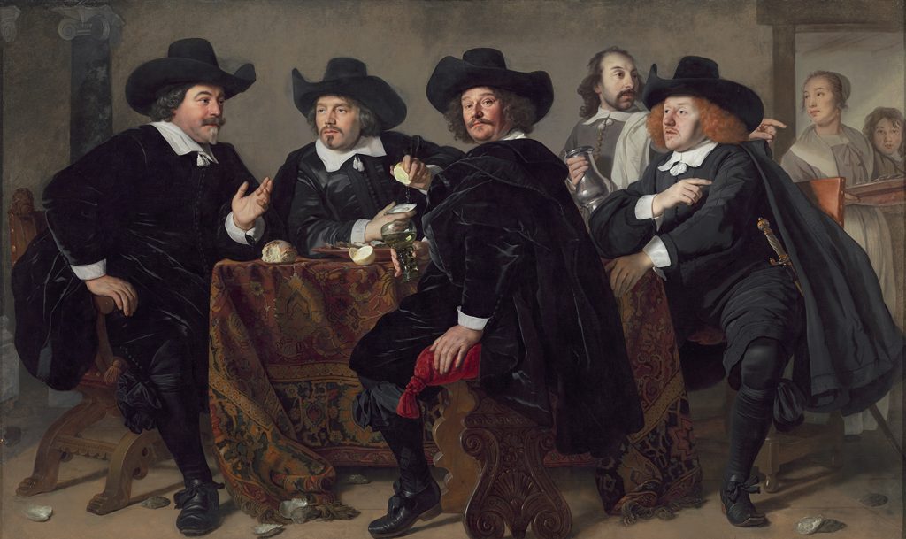
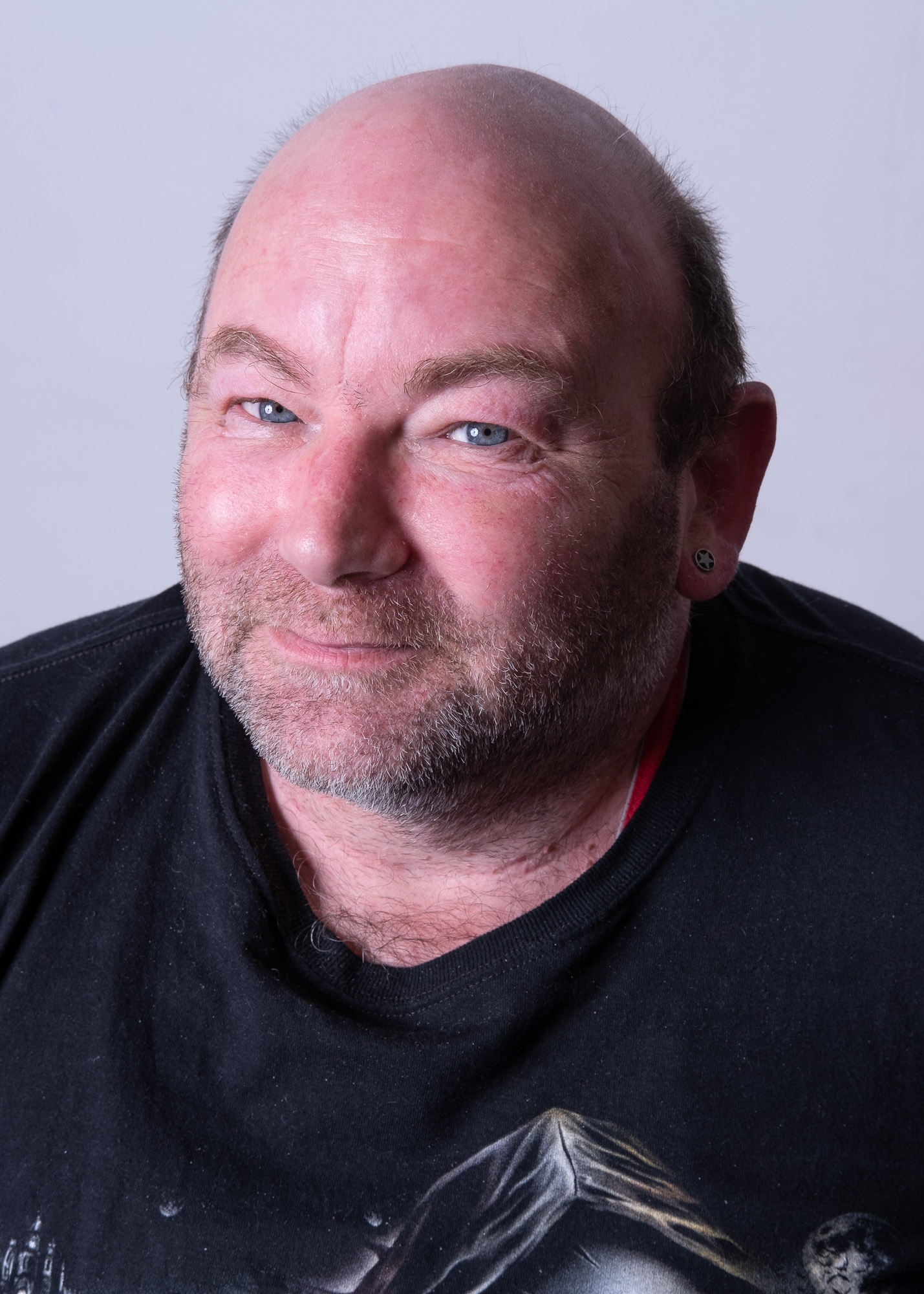
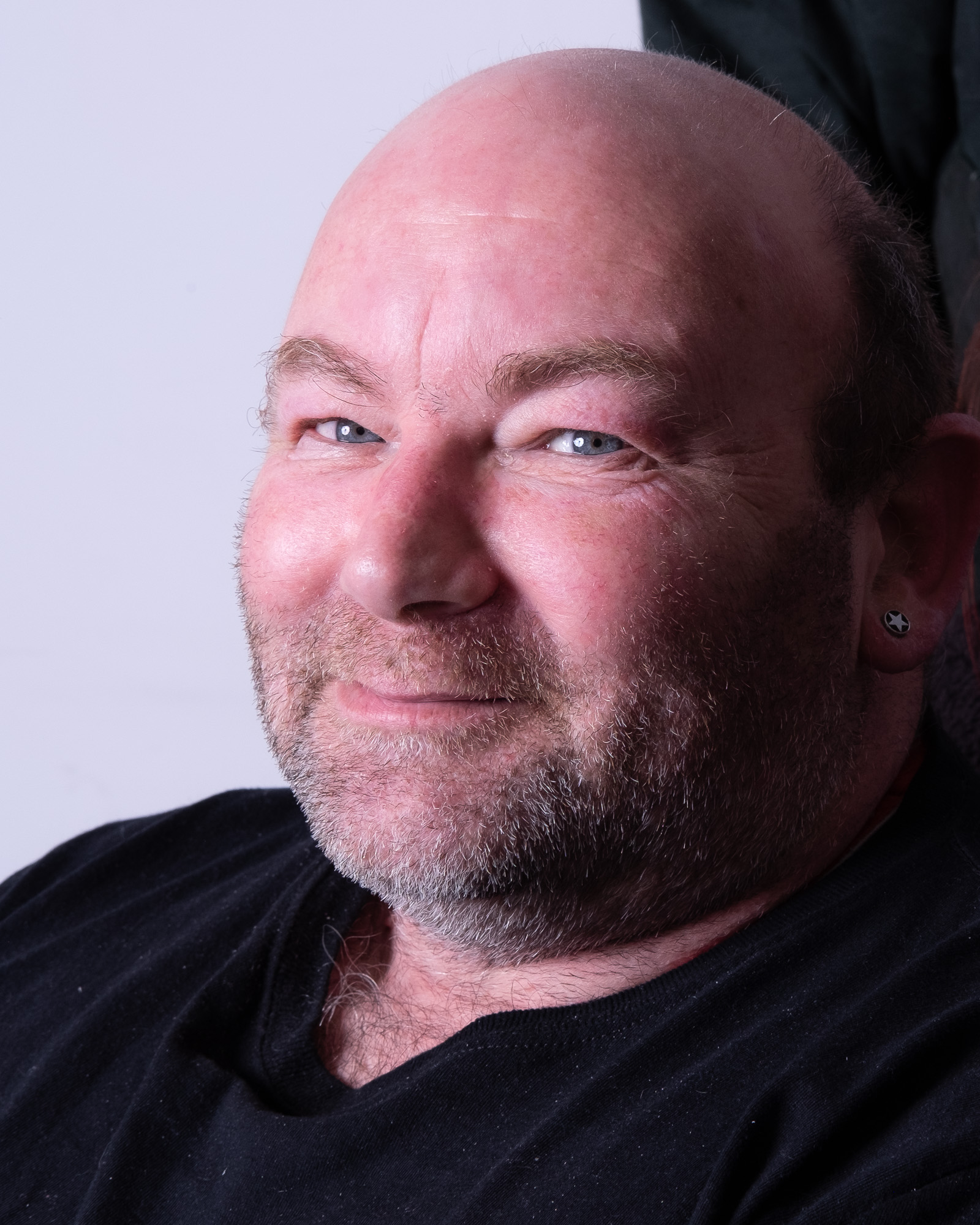
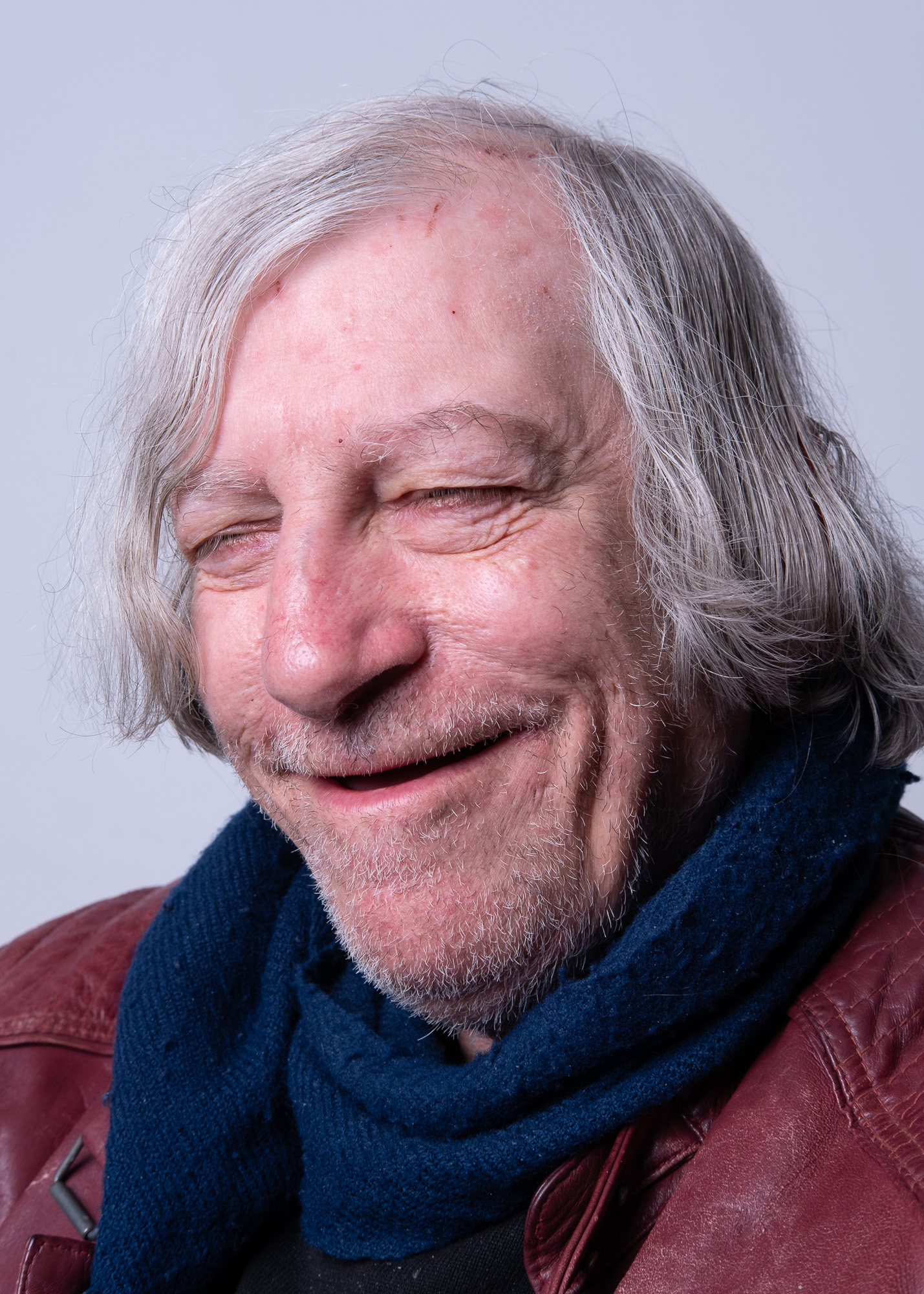
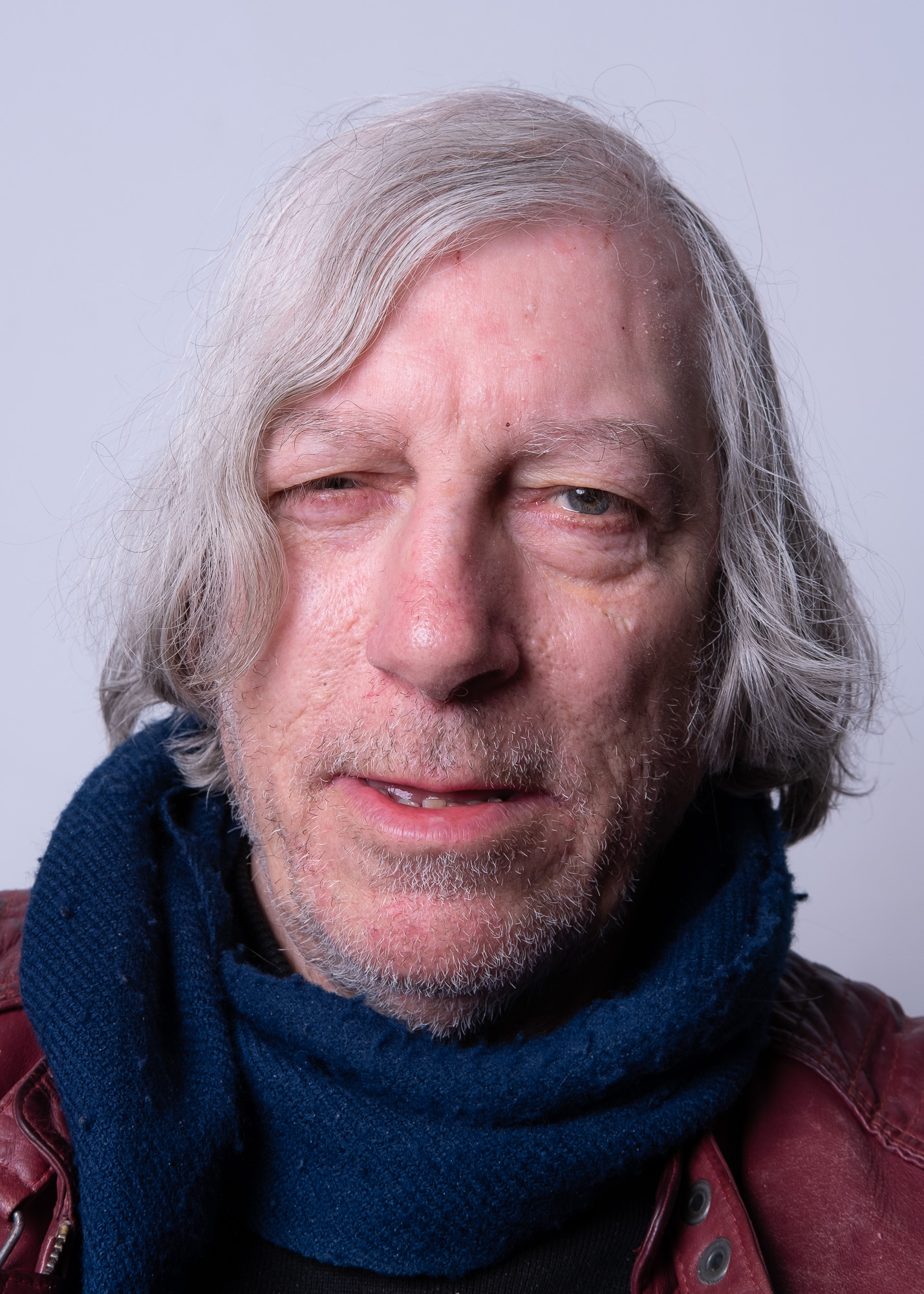
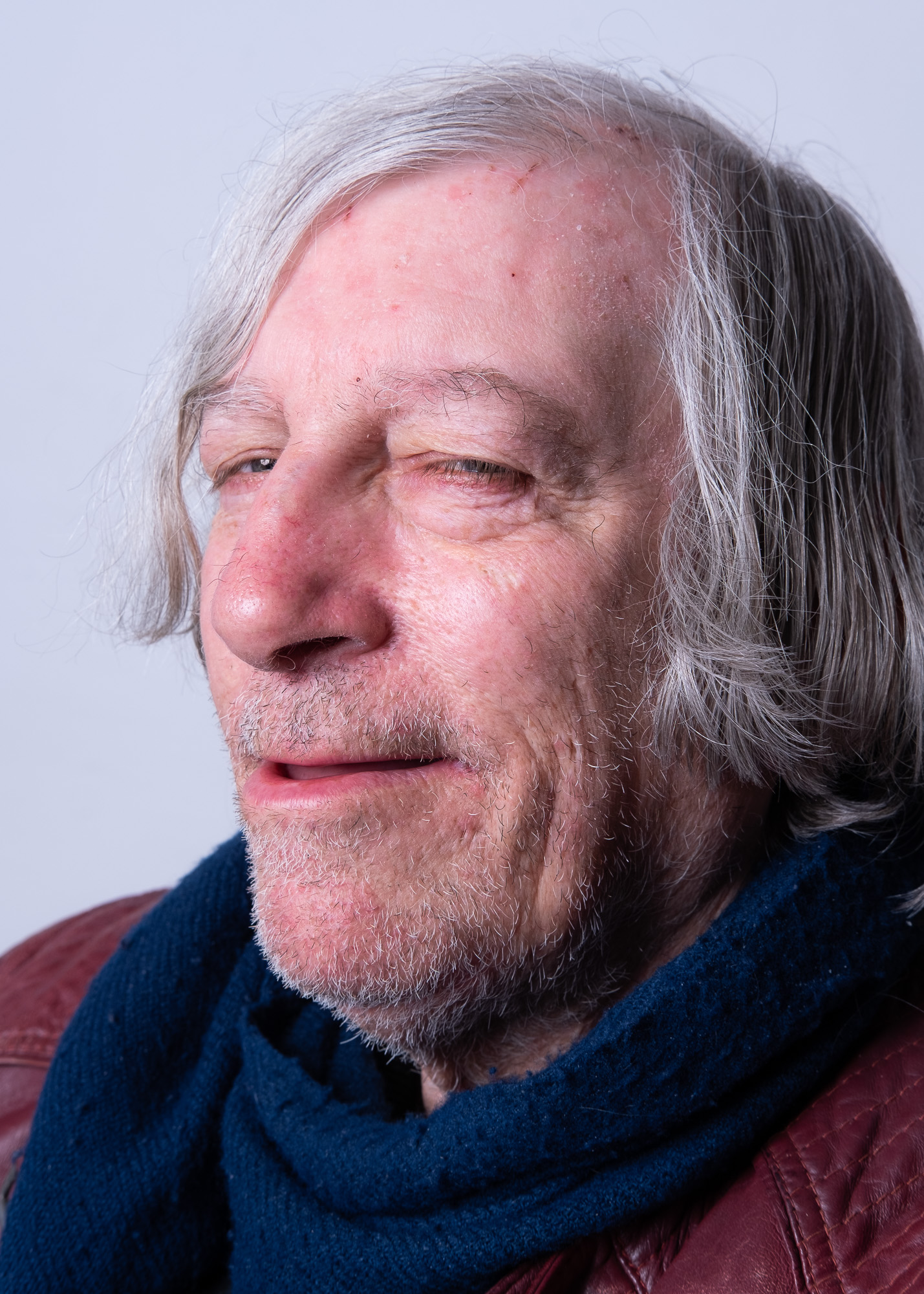
First shot at playing around with different ways of representing the group, taking influences from forms of group and individual portraiture. We spent some time looking through Dutch 17th Century paintings of civic leaders. This one by Bartholomeus van der Helst appealed, so we had a go using a simple single strobe set up.
Bartholomeus van der Helst, Four aldermen of the Kloveniersdoelen in Amsterdam, 1655.
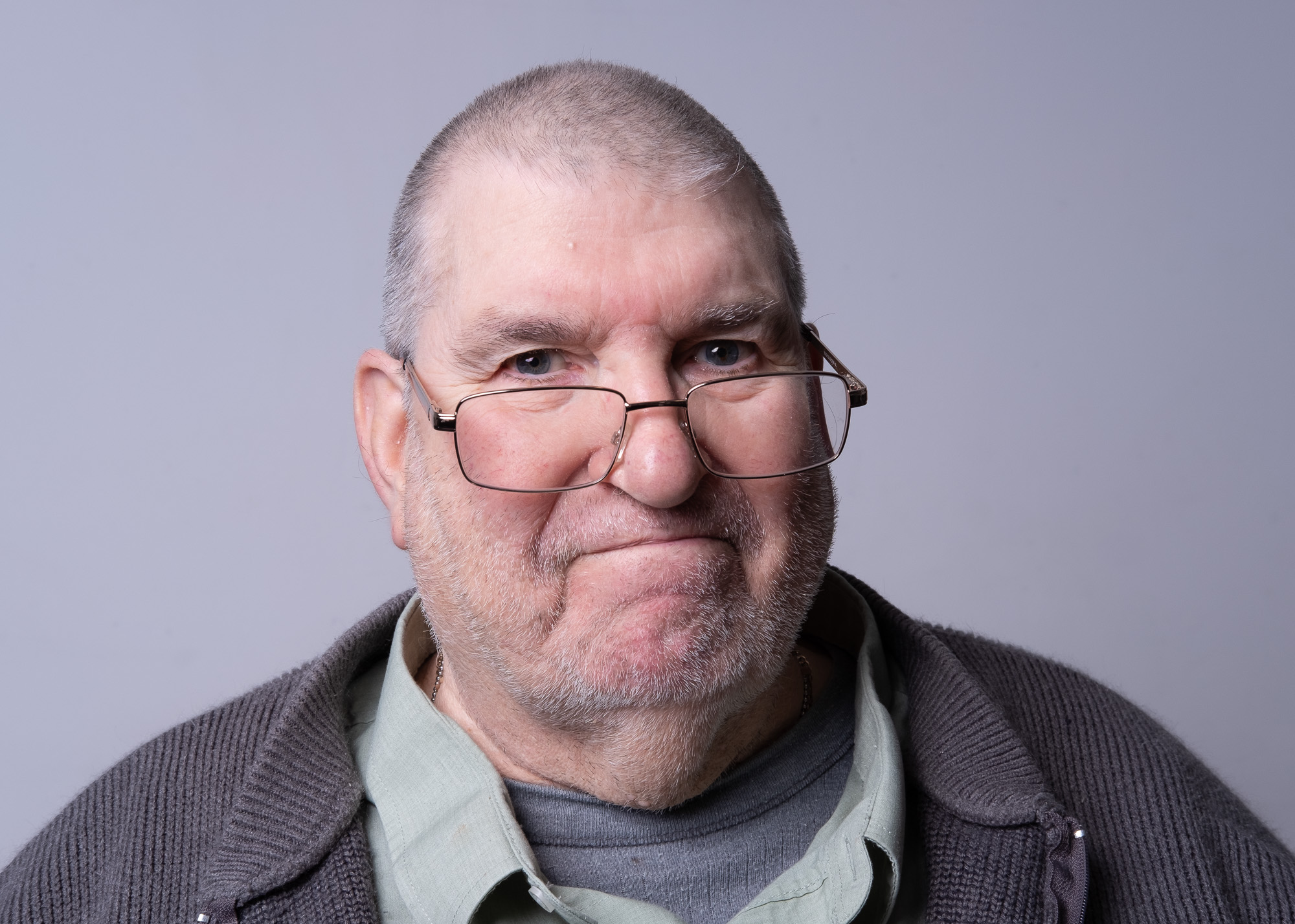
We’re going to need a shorter table … More to follow maybe, after the group have looked at the prints. Followed a session of individual portrait work.
I’ve used the time over the break to explore practically the analogue and digital dimensions of the project, and how I can visually, and in terms of process, explore both the ‘datafication’ of decision-making in regeneration, and the transition from chemical/material production/distribution to digital/symbolic production/distribution in this part of east London (and, of course, the residue of the former lies alongside, and acts and is acted upon, by the latter (I’ll post a project statement that encapsulates this later). So moving back and forth between chemical processing, handmade bookmaking, coding and image manipulation (whilst initiating three new projects, starting the London Creative Network intensive artist development programme, and preparing for two pop-up exhibitions in the coming month, and all the ongoing work).
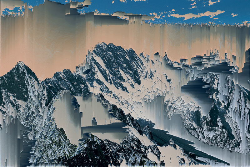
The algorithmic manipulation of images is a new strand, but important as it addresses part of the overall project that I have been struggling with (particularly finding a way to relate the quantification of community characteristics, and use of that data in decision-making on housing and social policy, and the lived, and located, experiences of residents). Using the Processing language (see Reas and Fry, 2007) to automate, through the use of algorithms, the manipulation of images is promising. To explore this, I have used Kim Asendorf’s pixel sorting (a term coined by Asendorf in 2010, according to Hight, 2013) code (available for download here; see examples of Asendorf’s work here and here).
Kim Asendorf, Mountain Tour series, 2010
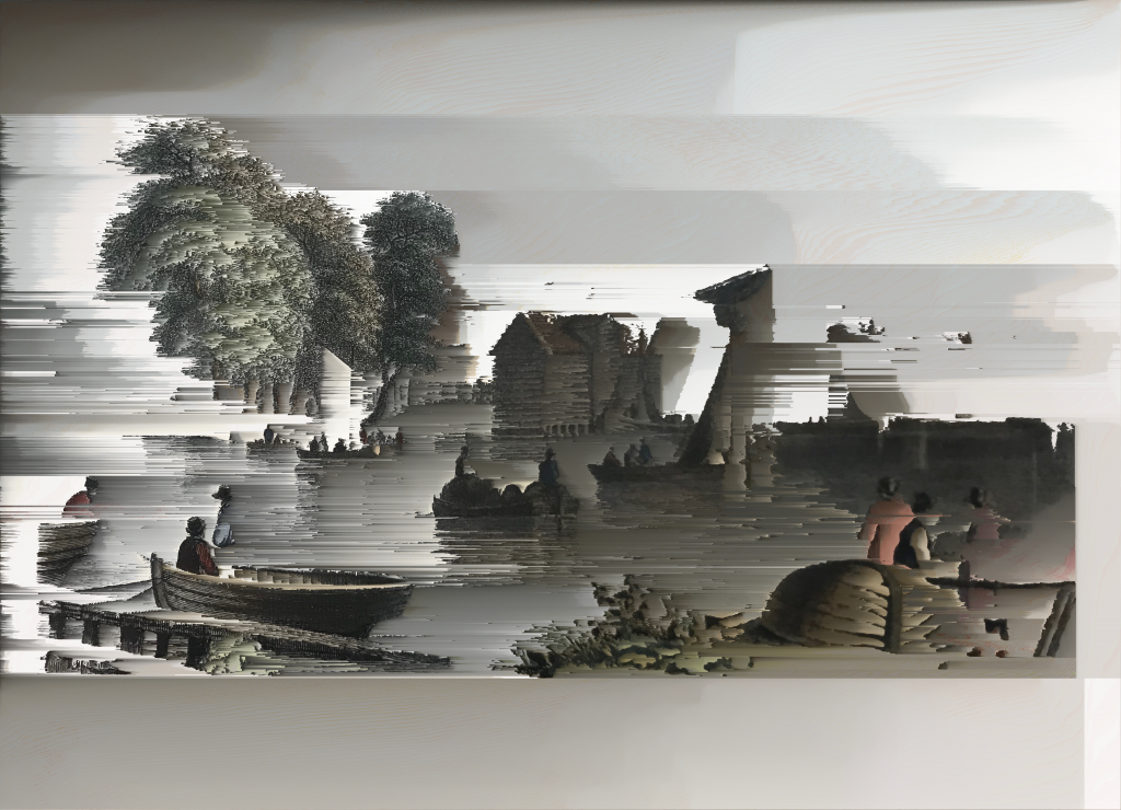
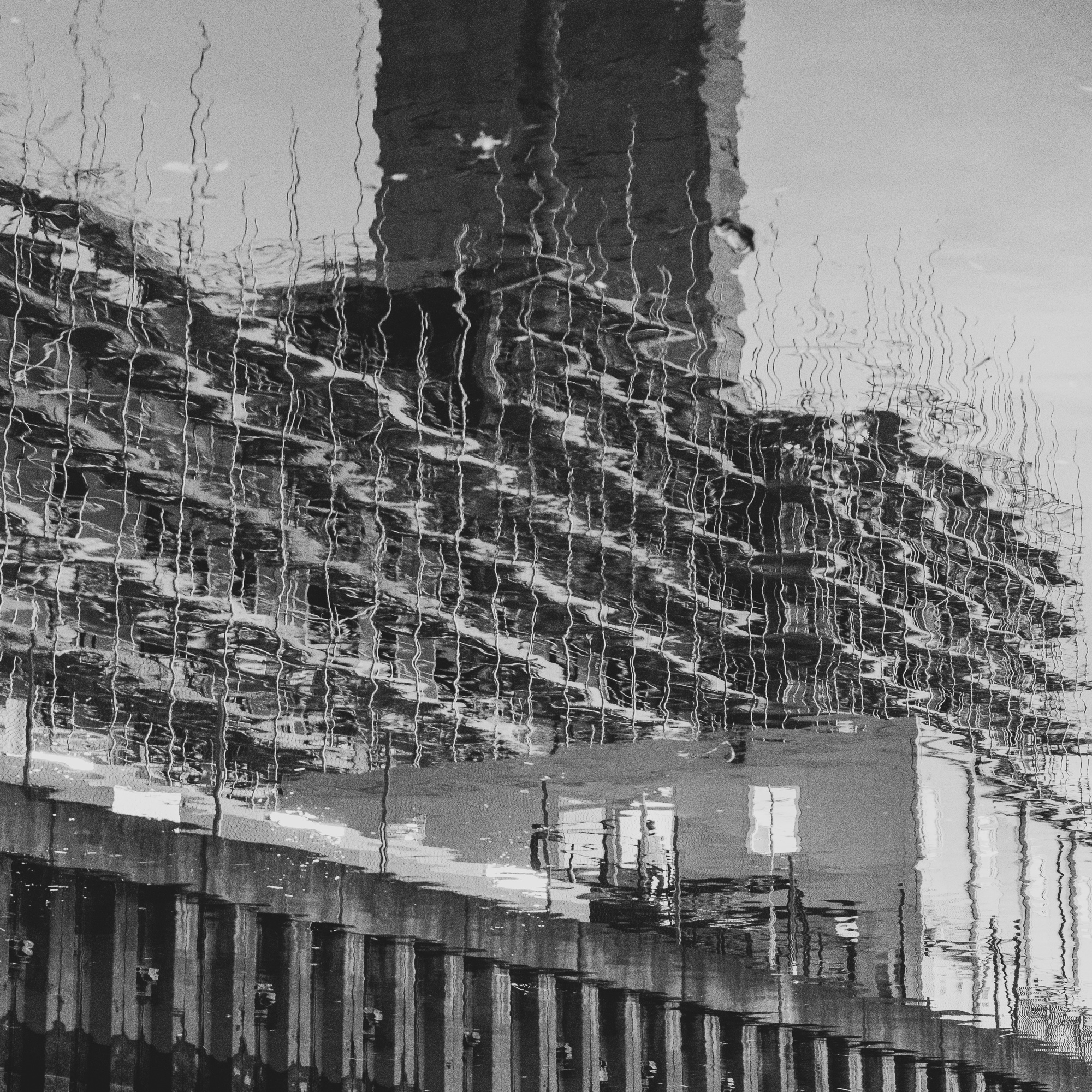
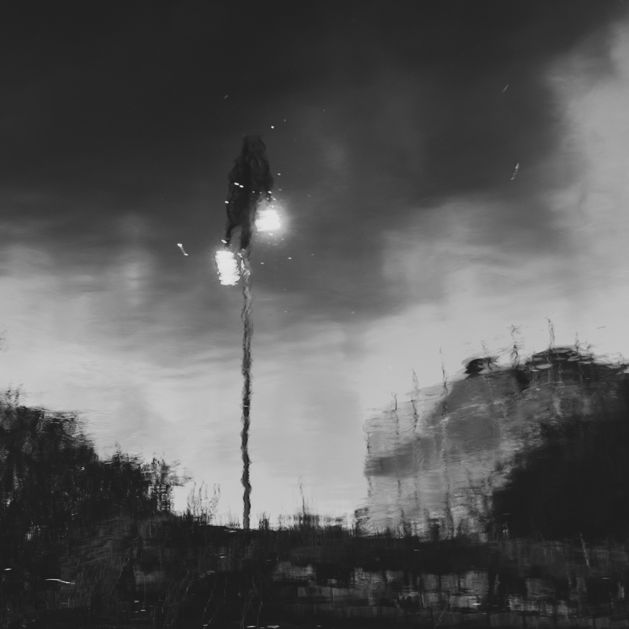
At this point, I am playing around with changing the thresholds in the programme to produce different treatments of some of my landscapes and portraits, as well as some archival material. Here’s a version of the Barking Harbour image featured in an earlier post.
Andrew Brown, Barking Harbour treatment, 2020
Each image is uploaded onto a surface as a bitmap and the procedure (sketch in Processing terms) runs along rows or columns (this can be set) to look for pixels in terms of darkness, lightness or brightness (this can be set). If set to search for ‘darkness’ along rows, the algorithm searches along each row for a pixel which lies within the thresholds set for ‘darkness’ and places these in order until it reaches a pixel that falls outside the defined limits. The number of iterations (loops) for this process can be set. The thresholds for each can be set to create different forms and levels of ‘mutilation’. This gives me an opportunity to contrast chemical degradation of images (using the immersion methods developed by Matthew Brandt) with these forms of digital degradation. I want to go beyond playful data-moshing, however, and see if I can feed in data (for instance, social progress indicator data) relating to the specific communities that I am working with.
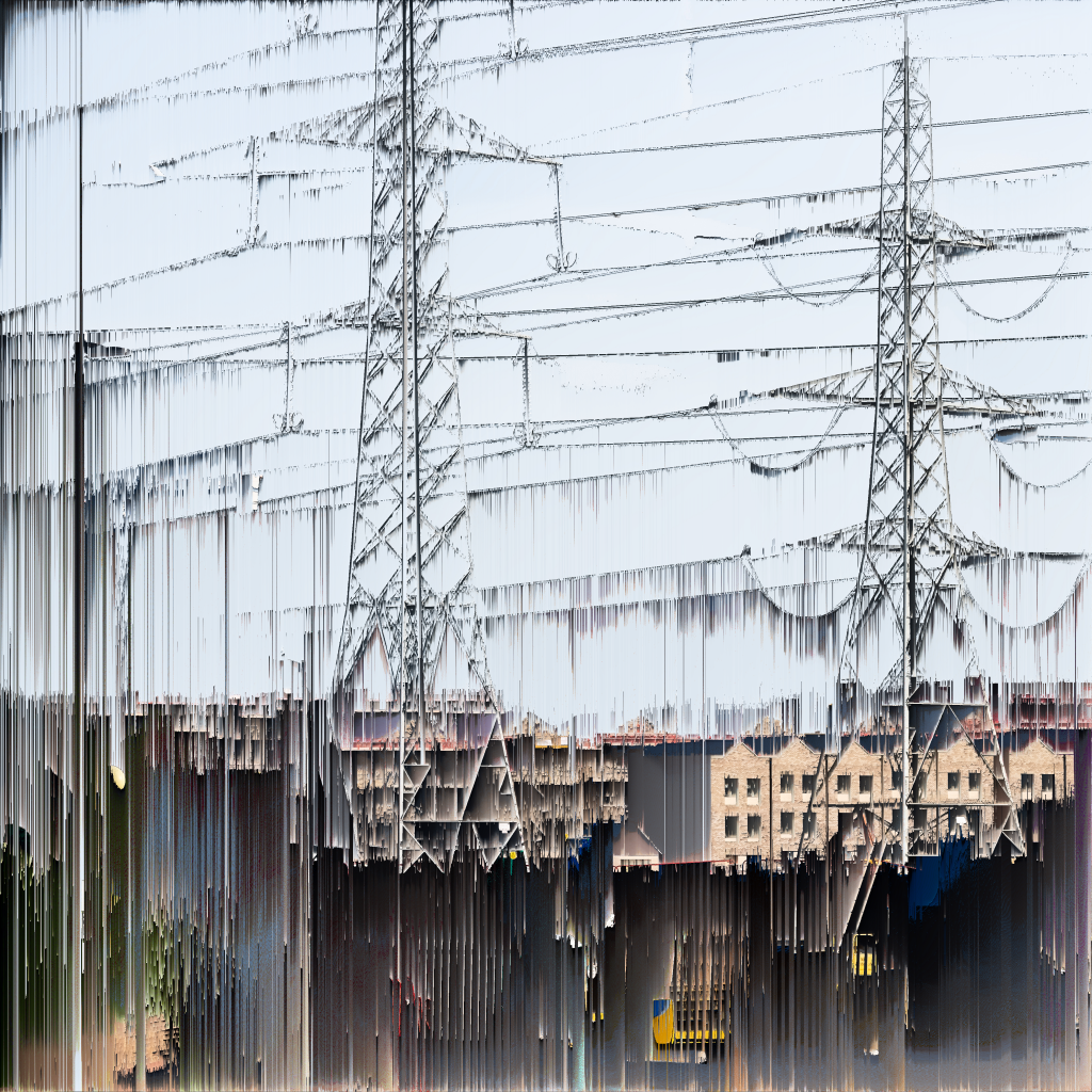
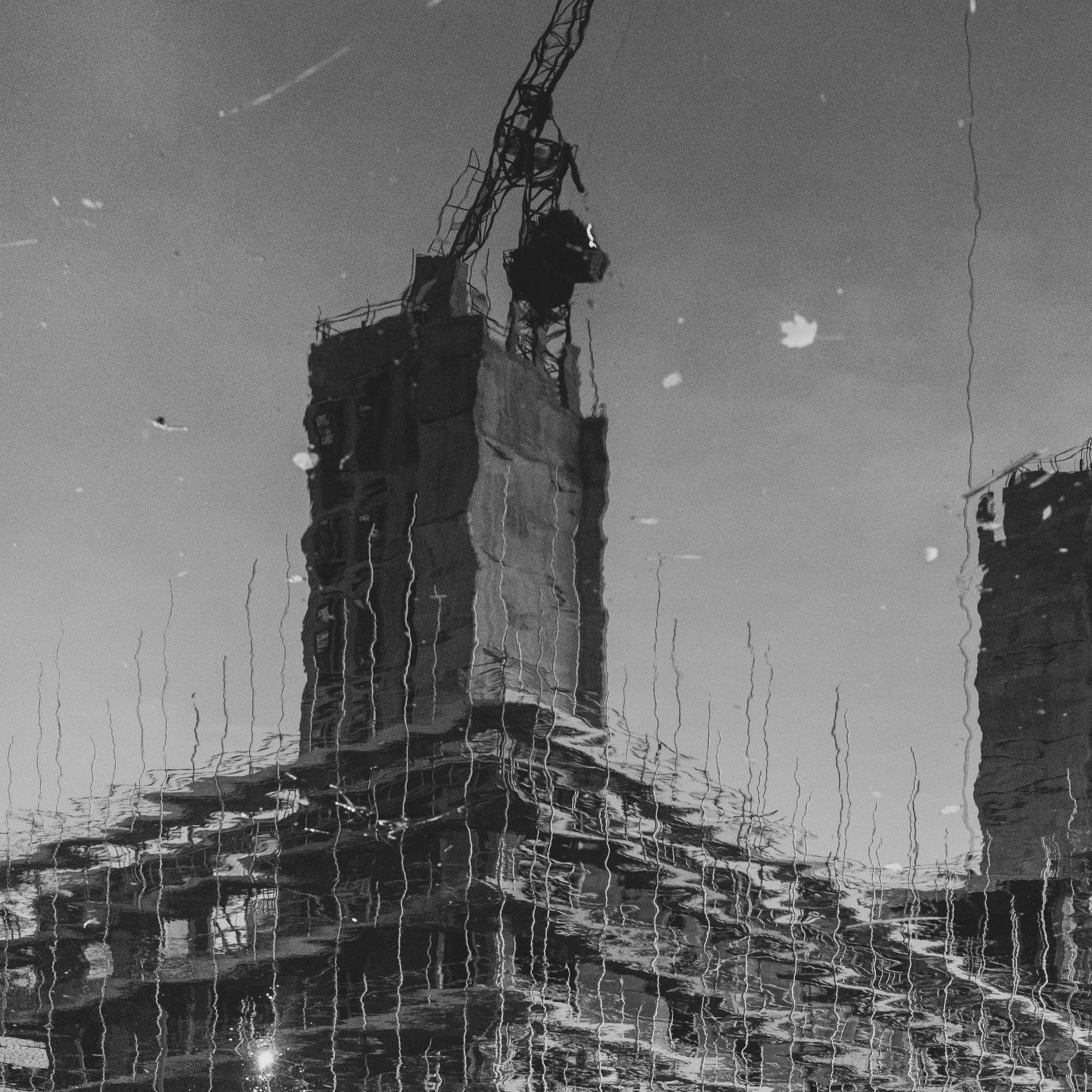
Andrew Brown, Barking RIverside treatment, 2020
This raises again the question of how to present the outcomes of the manipulation. My intention here is to continue to move back and forth between the digital and the analogue, and the abstracted and the located. So printing these could take us back into the analogue, local/located and visceral. As with all this work, the question is what is gained and lost in each translation between forms, if translation is possible, of course, in any meaningful sense (see Apter, 2013).
References
Apter, E. 2013. Against World Literature: On the politics of untranslatability. London: Verso.
Hight, J. 2013. An introduction to Kim Asendorf. Unlikely Stories, Episode IV. Online https://www.unlikelystories.org/13/asendorf0913.shtml [accessed 23.01.2020]
Reas, C and Fry, B. Processing: A programming handbook for visual designers and artists. Cambridge, Mass.: MIT Press.
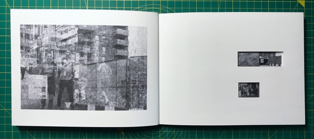
Experimenting with different book forms. The challenge with the neuropolis series has been to show the relationship between each final image and its three constituent images. I used Japanese stab binding for this book. As the pages are folded (with the open edge at the binding), I have been able to print the grid of initial images ‘inside’ alternate folded pages, and cut windows to show the three images that are used for each of the final images.
The paper is double-sided matt 170 gm. Heavier than I would have liked, but OK for a trial. More difficult is getting photo paper with the right grain direction. To get the book pages to sit properly requires short grain, but this paper is long grain. The only solution, for small scale production by hand, would seem to be to use watercolour or sketching paper (which can be bought in larger sheets and cut to size with the correct grain), and to coat it for inkjet printing.
Stab binding isn’t ideal for this kind of book. It would be better to use a form of binding which would allow the pages to lie flat. I also still like the idea of presenting these images in a portfolio box, and allowing the reader to order the images in different ways. More experiments to come.
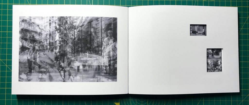
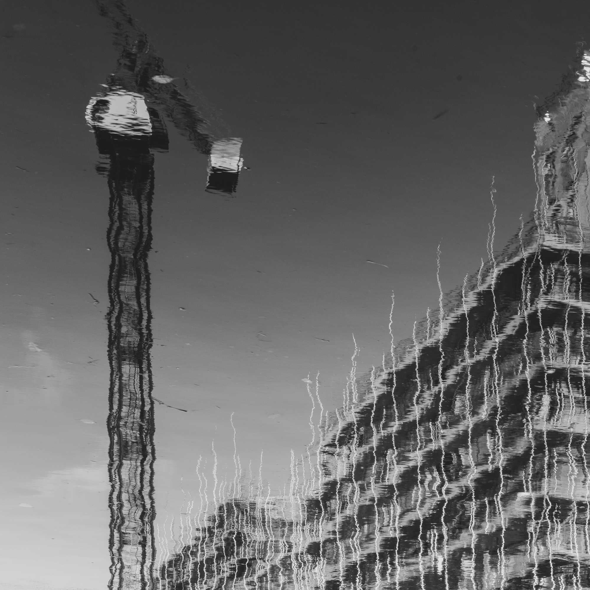
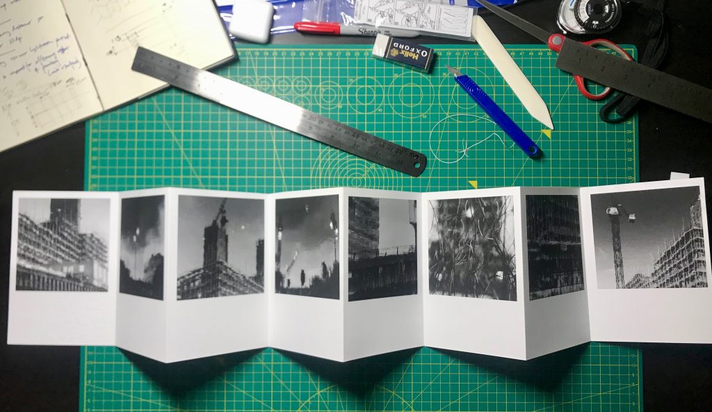
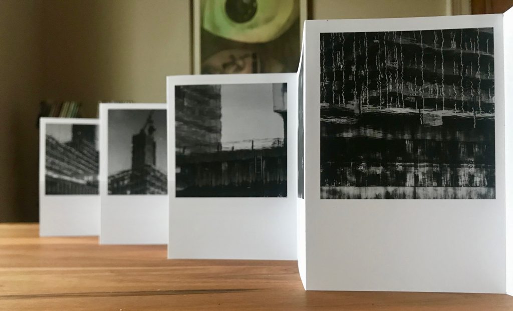
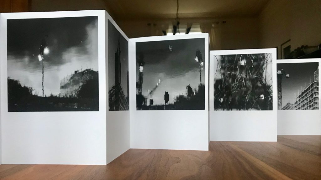
I am working through ideas for a portable exhibitions, and seeing what can be produced with existing resources. Following earlier consideration of work by Dayanita Singh, I have produced some prototype accordion books, to explore size and format, and the suitability of different types of paper (in terms of printing, use in book production and in display). I’ve used the following images of housing developments in Barking, for instance.
I’ve used 200 gsm single-side coated matt photopaper for this. There is a problem in getting stock from which I can get A3 sheets which are short grain. The print surface is good (certainly works well for these monochrome images) and it handles well for book making.
There is work to be done on how they would be used in display, and how different angles of view and light can be used creatively (and, consequently, how images are sequenced and arranged). Some kind of clip that holds each fold at 90 degrees would be helpful (I saw something like this used at Paris Photo last year). The next step is to explore other formats for books/displays and other sequences of images.
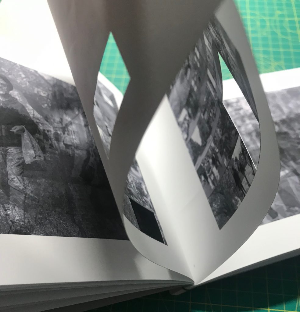
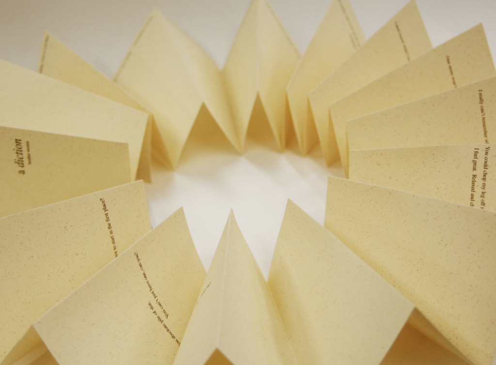
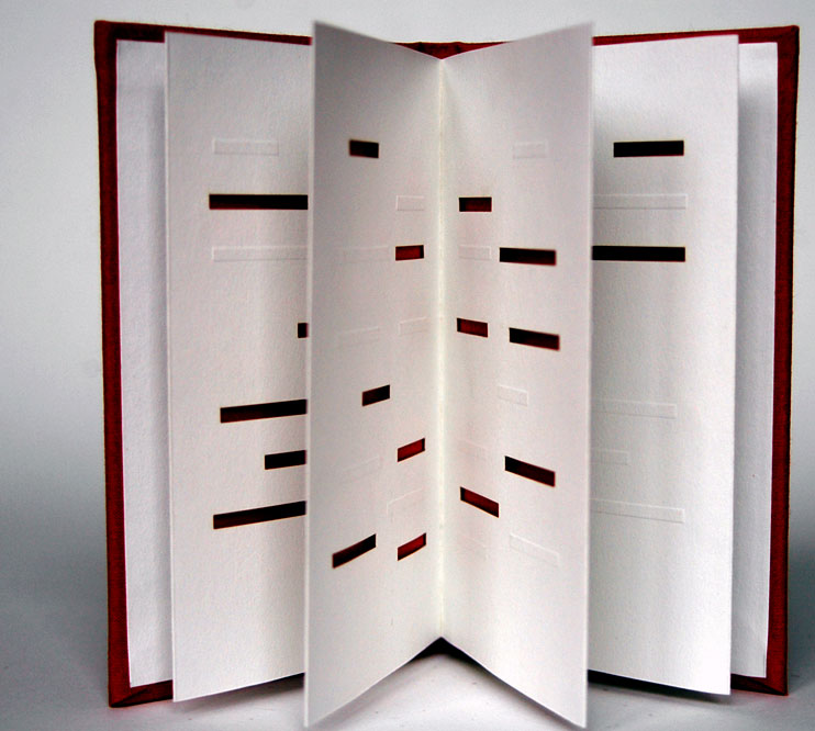
I have been looking at work by Heather Weston, a book artist who explores ways in which established book forms can be used creatively to produce resonances, and tensions, between form and content, for instance in her works a diction (2004) in which the pages are the shape of a pint glass, and unfold into a circle, READ (past, tense) (2000) which is printed with heat sensitive ink that responds to the touch of the reader and Paper Cut: relief (2007) dealing with self harm and taking the form of an accordion book with cut outs (below).
Heather Weston, a diction, 2004
Heather Weston, Paper Cut: relief, 2007
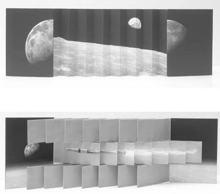
In Bookcraft (2008), she refers to Karen Hanmer’s Destination Moon(2003) which takes the form of a ‘flag book’ (a kind of accordion book) that juxtaposes archival photographs of the Apollo Manned Space Programme with John F. Kennedy’s “Man on the Moon by the end of the decade” speech and a whimsical song about a romantic journey to the moon.
Karen Hanmer, Destination Moon, 2003
This dynamic handmade book form, which has been produced using an inkjet printer, is well suited to the forms of juxtaposition and change that I am exploring in my own work, and warrants some exploration.
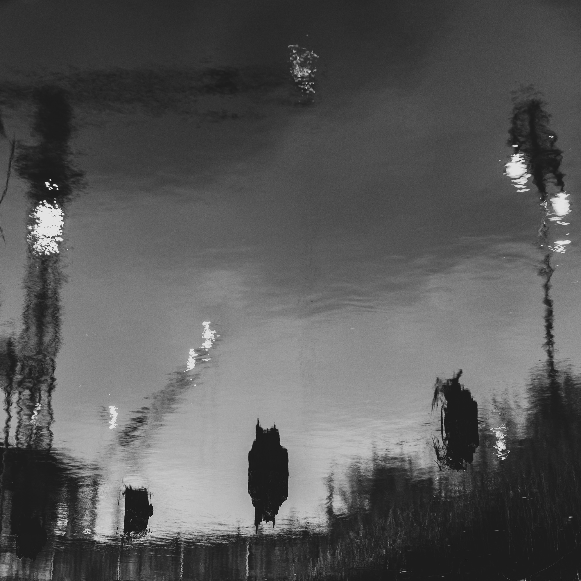
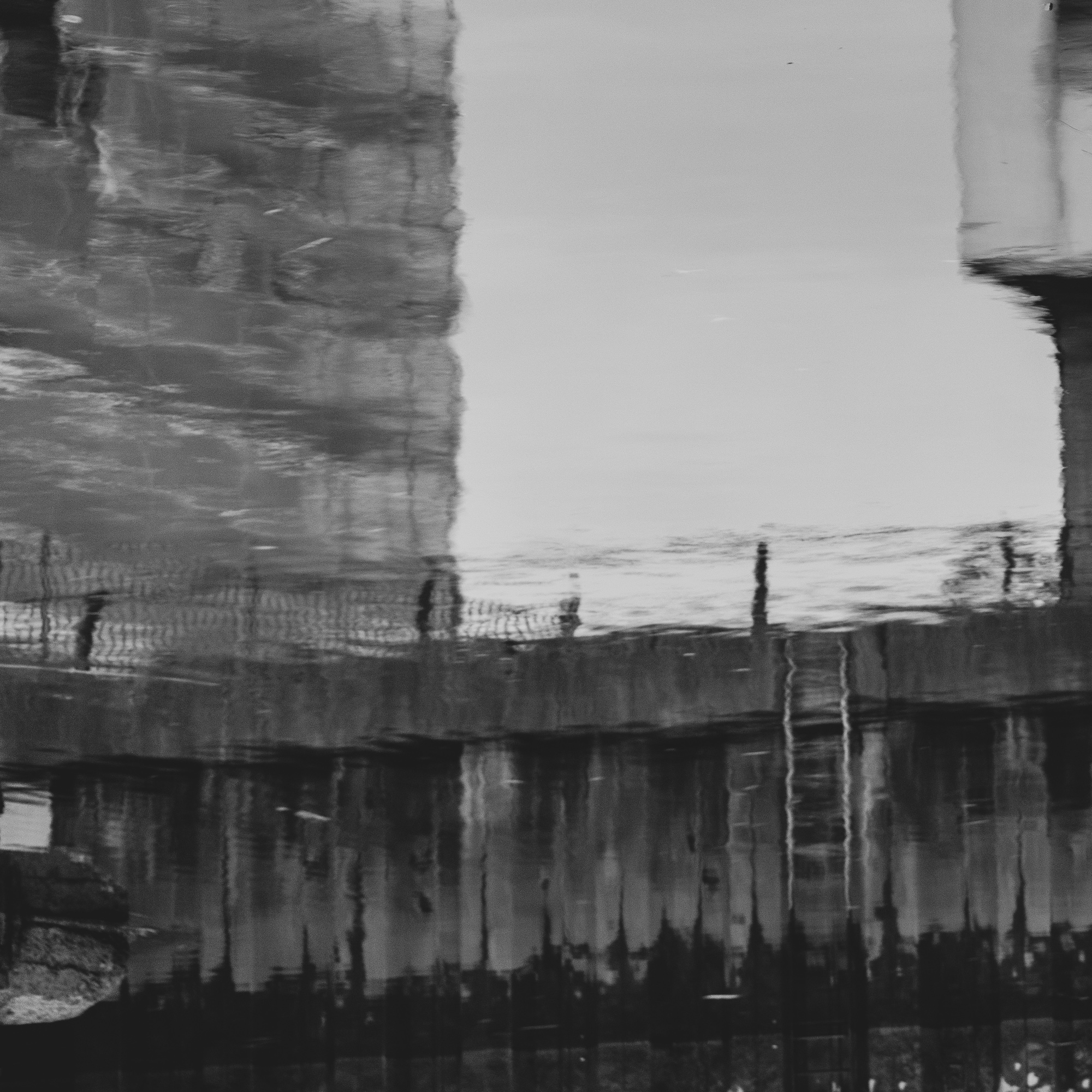
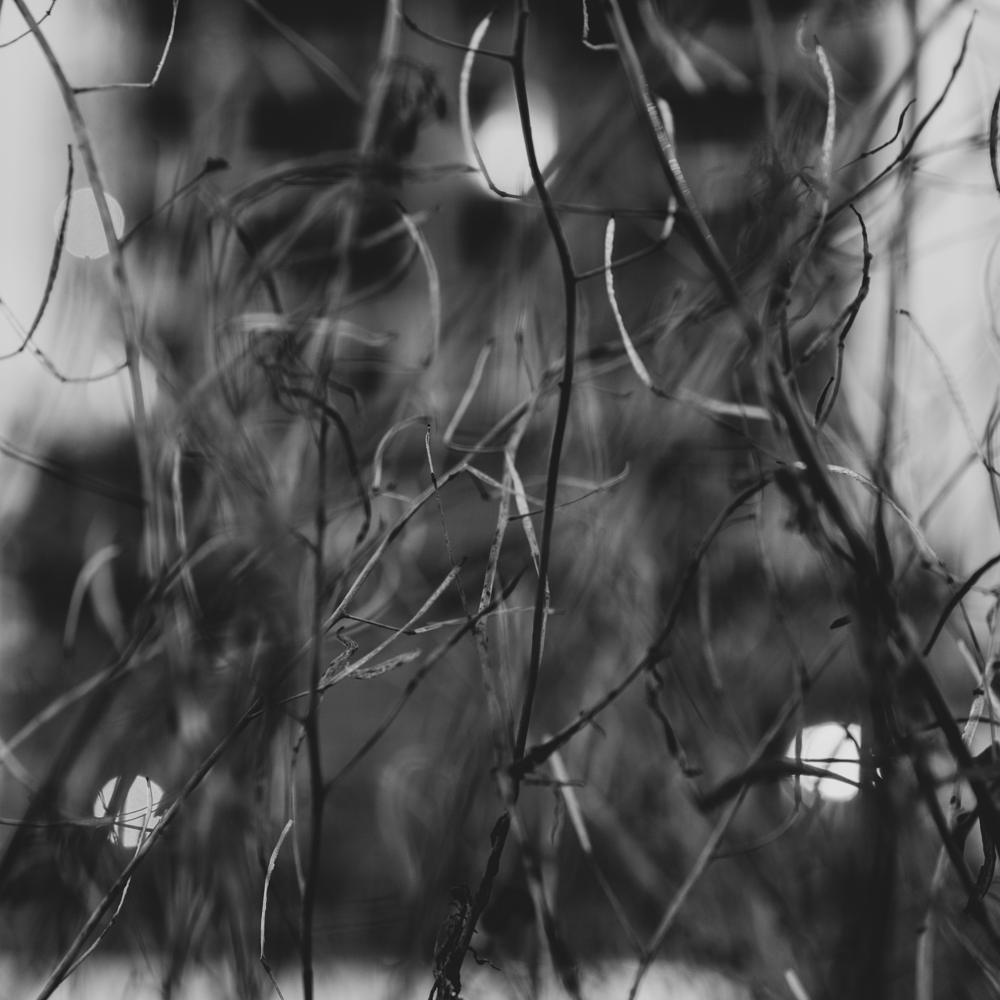
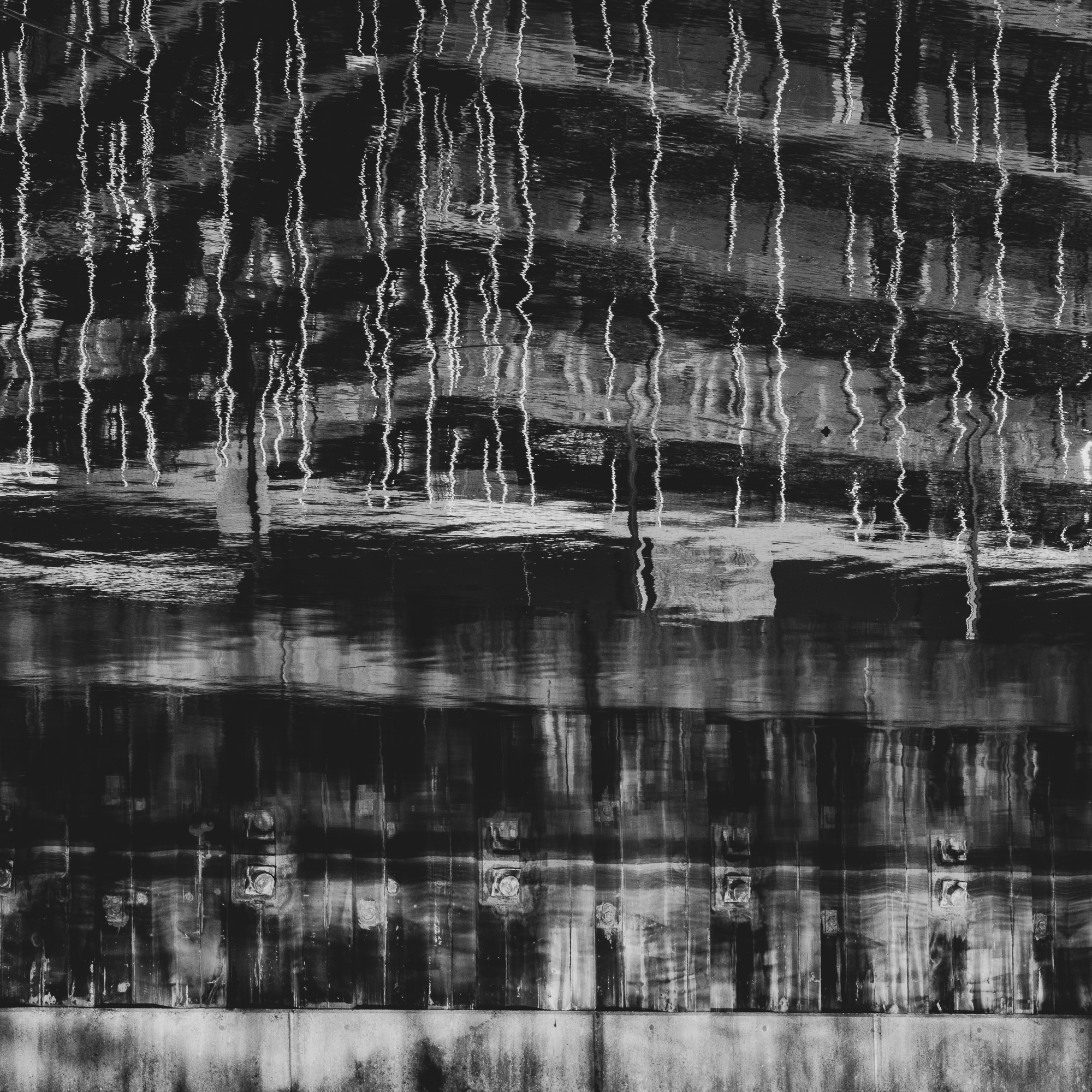
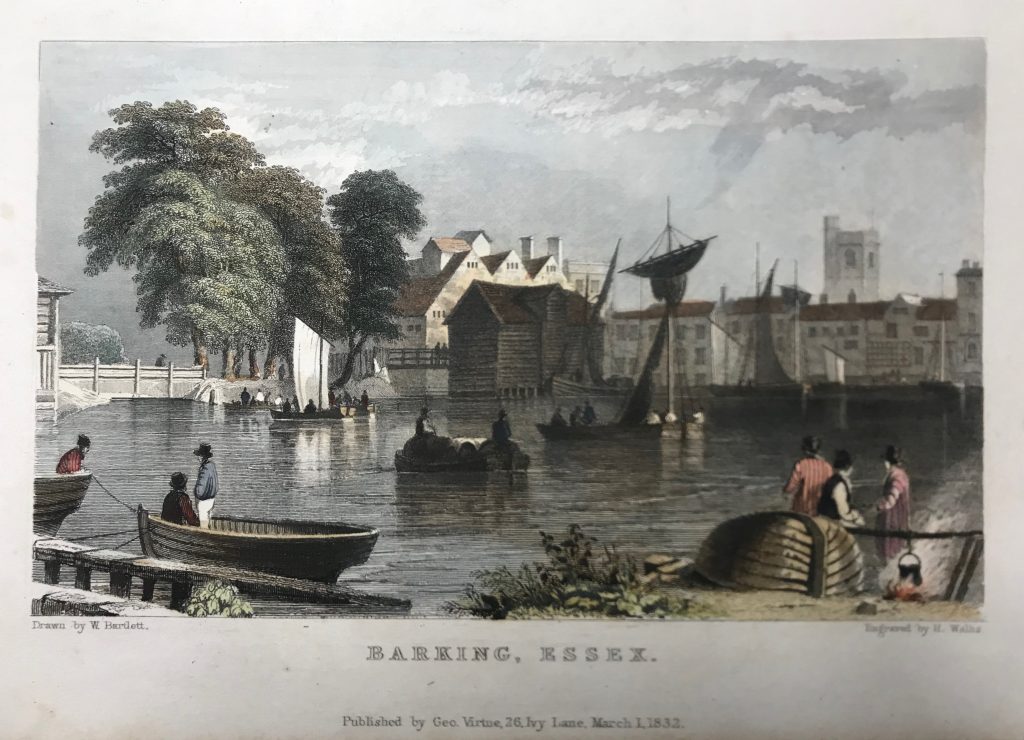
As a foonote, the black and white images above are all reflections of developments along the River Roding taken from the same place as this 1832 drawing of Barking town (the vantage point is now a supermarket car park).