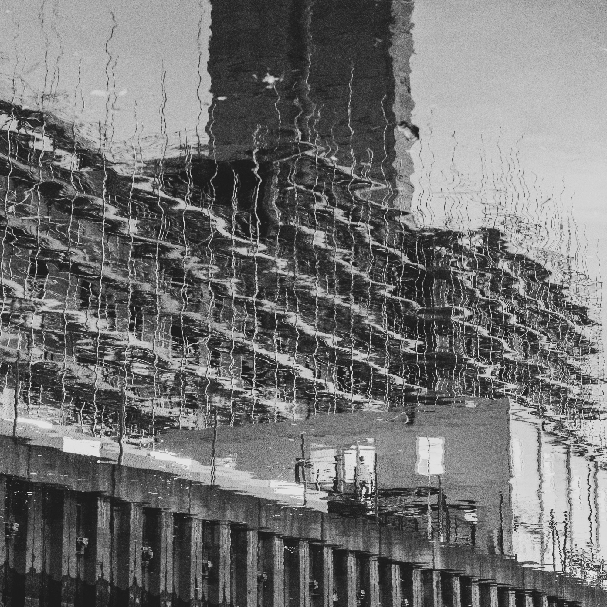
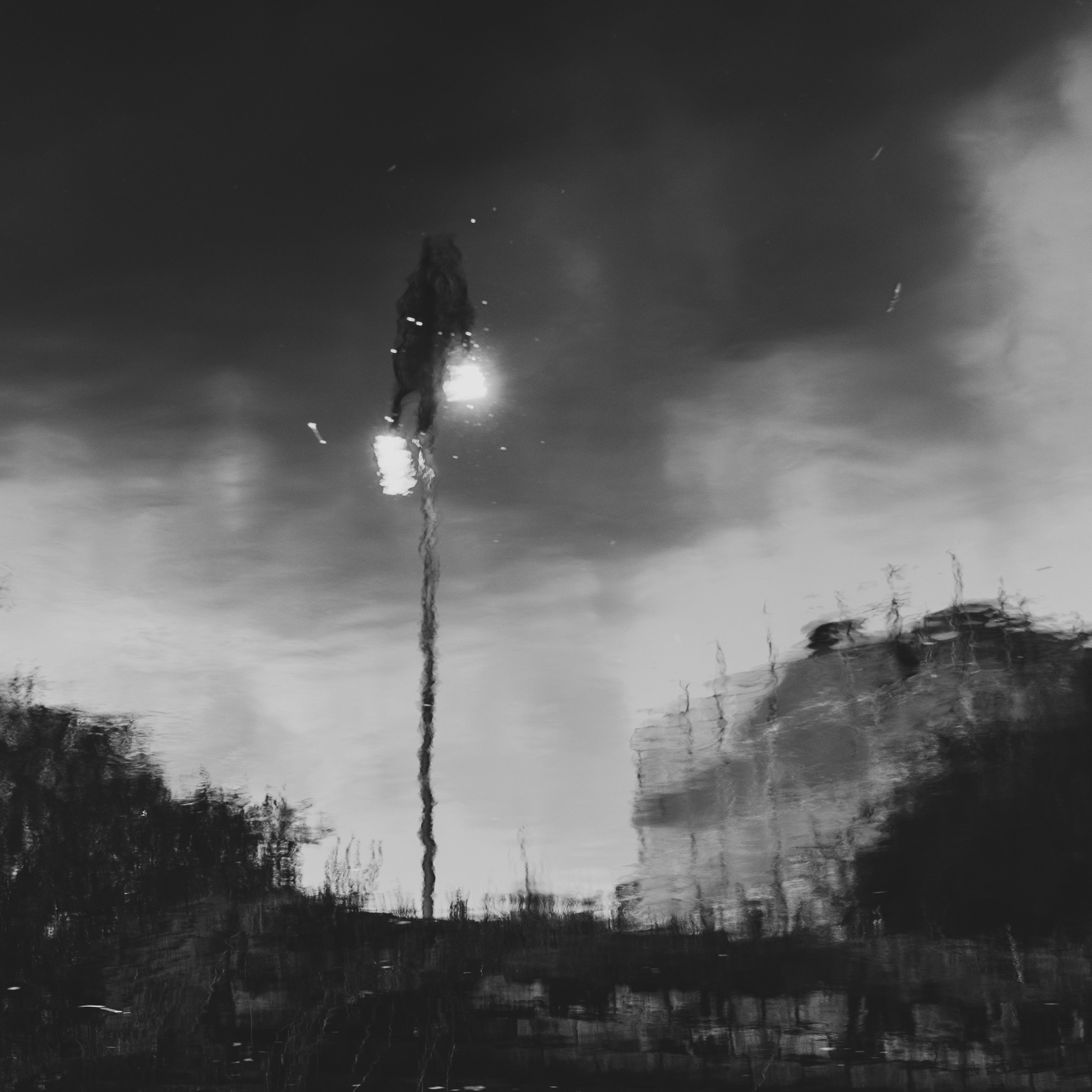
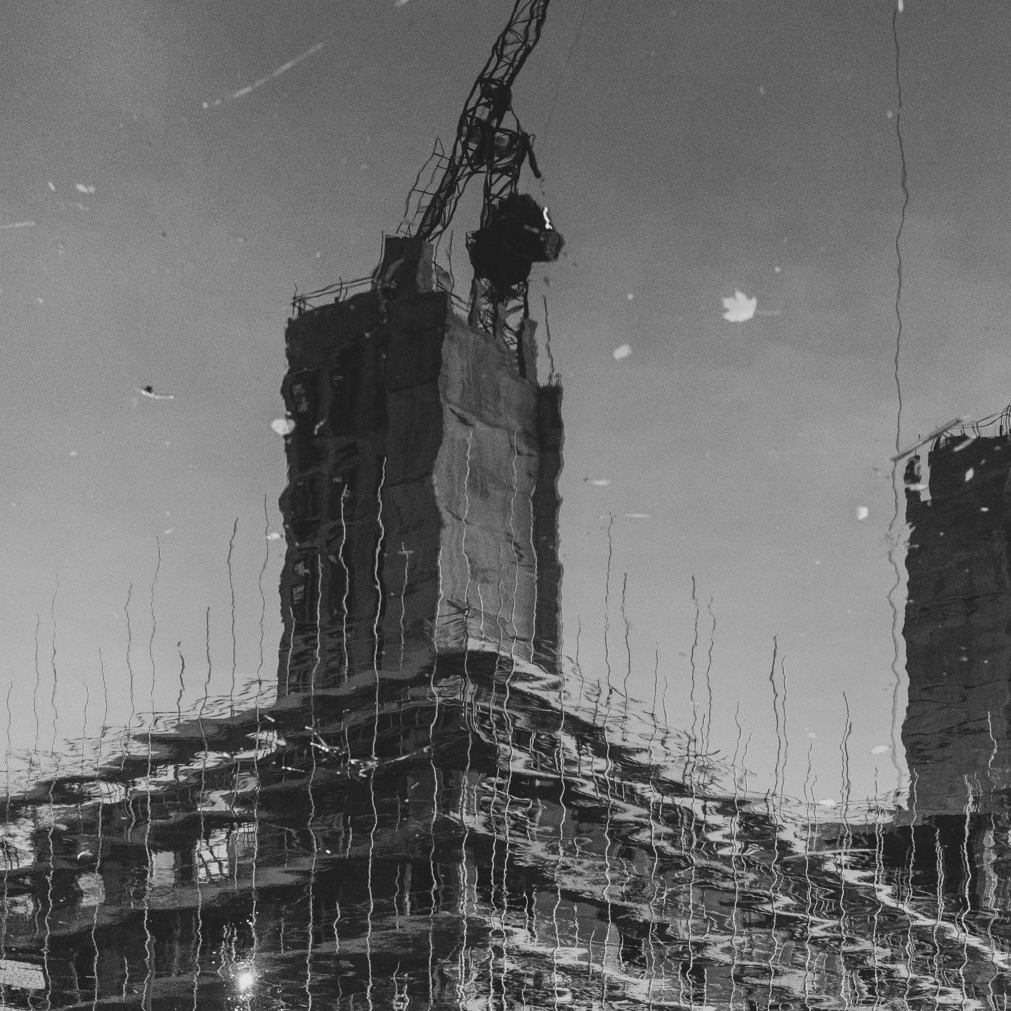
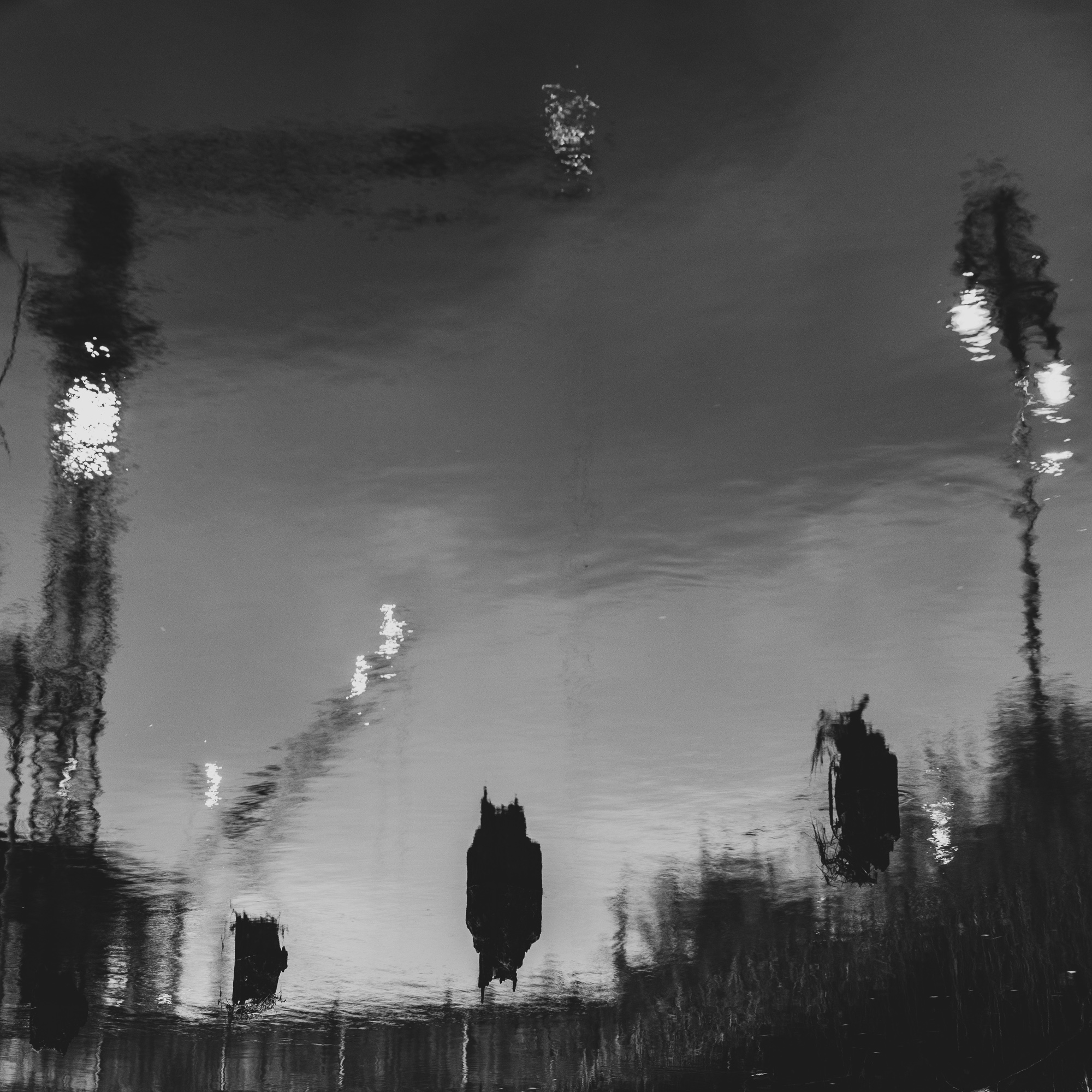
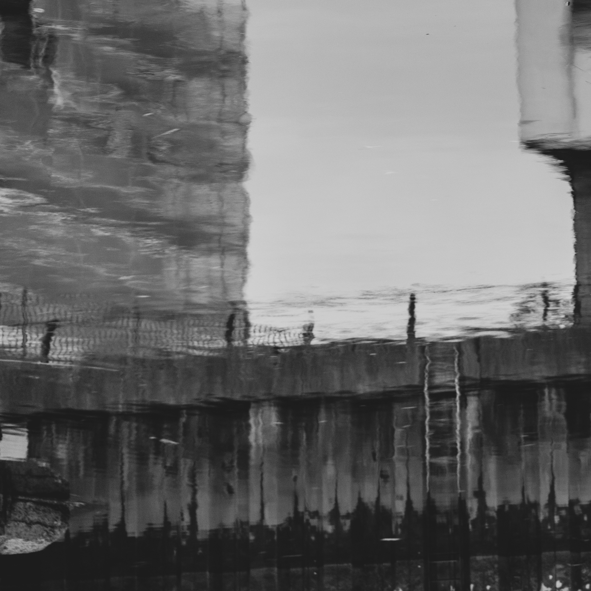
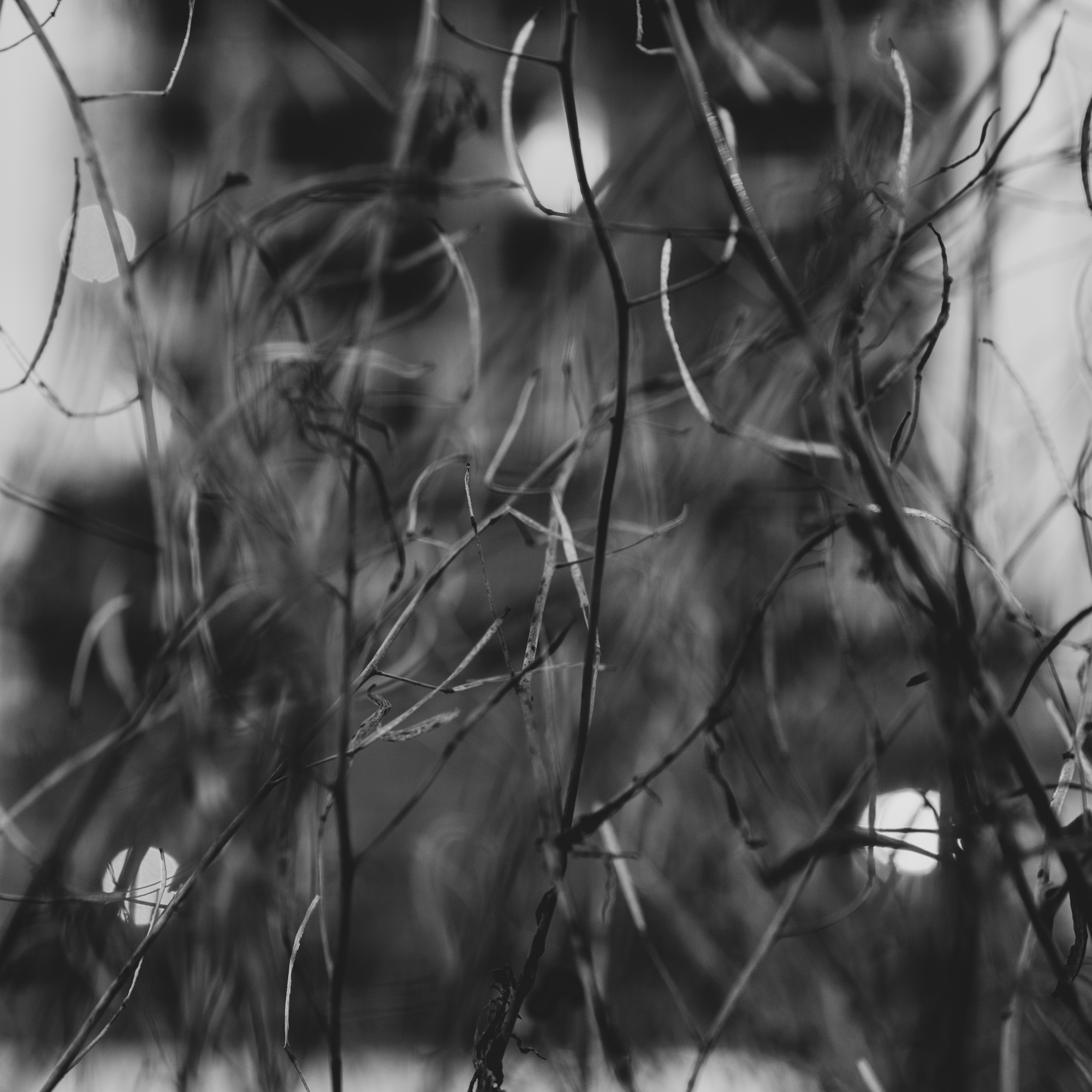
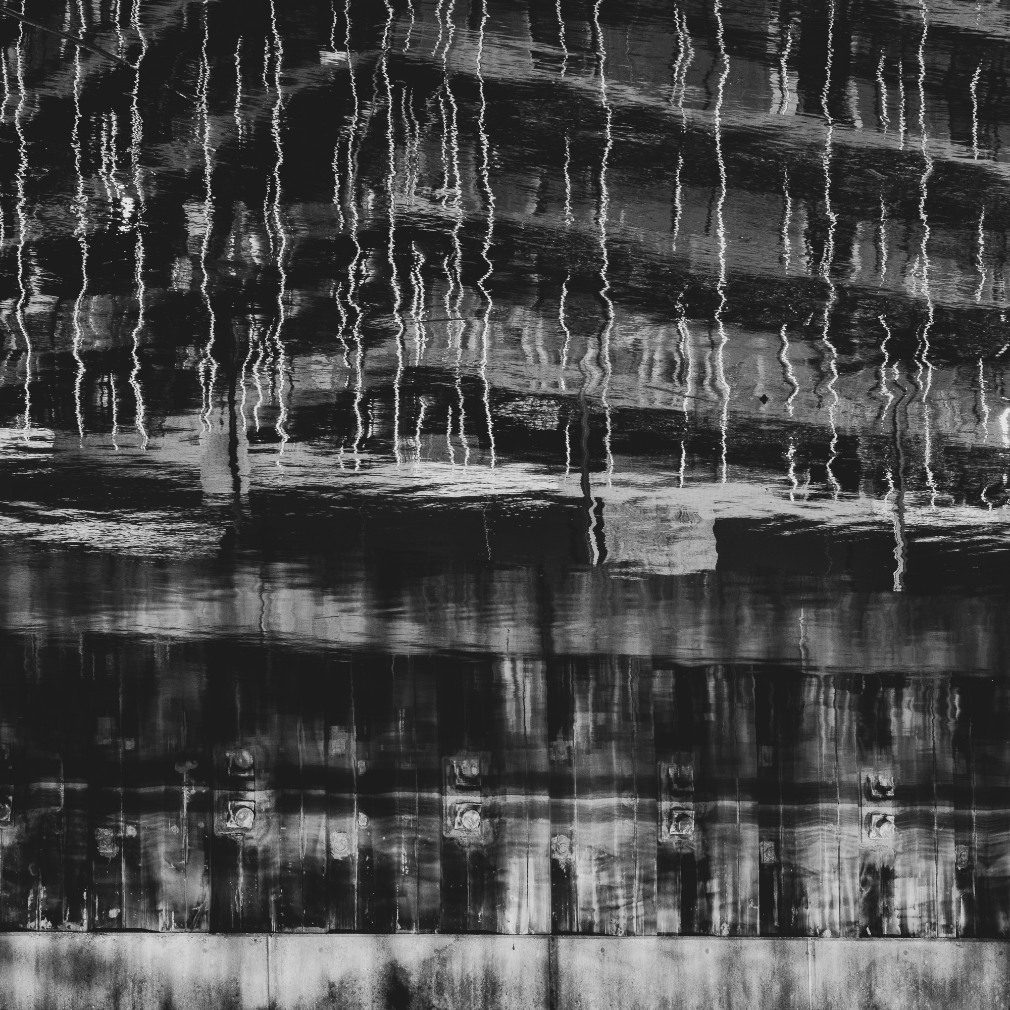
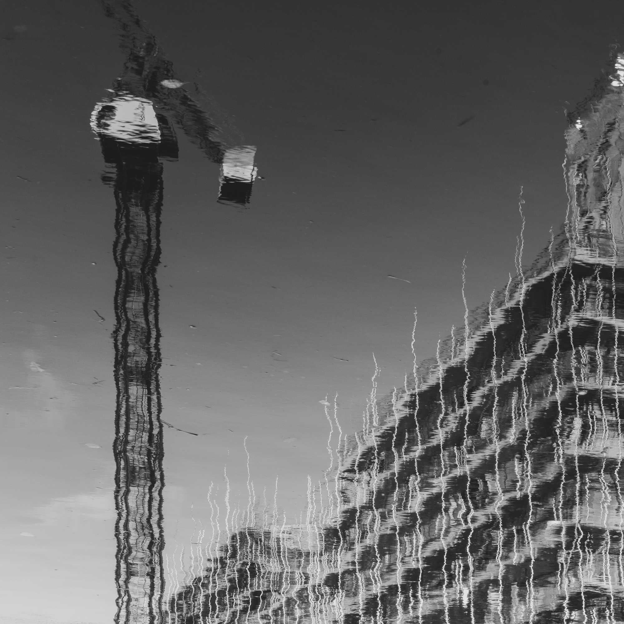
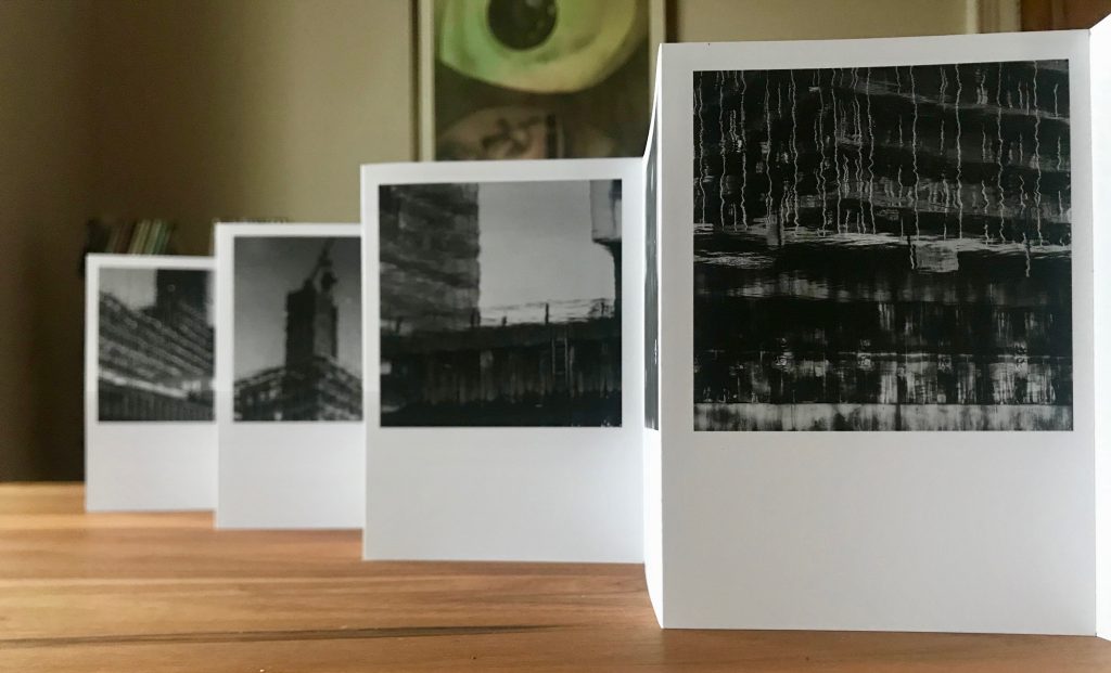
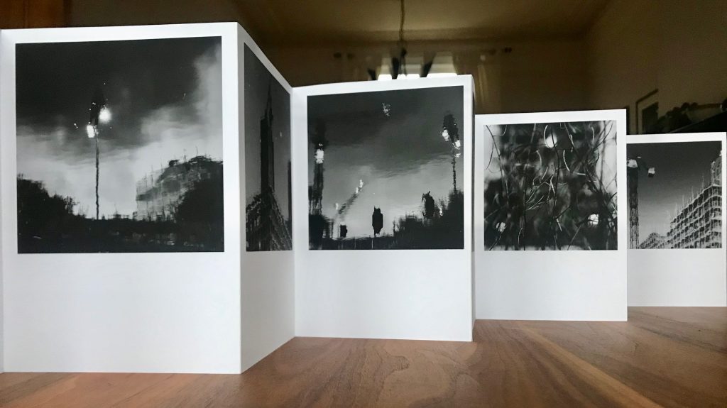
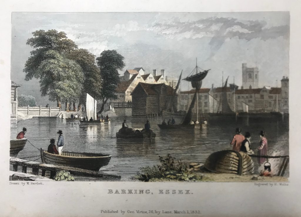
I am working through ideas for a portable exhibitions, and seeing what can be produced with existing resources. Following earlier consideration of work by Dayanita Singh, I have produced some prototype accordion books, to explore size and format, and the suitability of different types of paper (in terms of printing, use in book production and in display). I’ve used the following images of housing developments in Barking, for instance.
I’ve used 200 gsm single-side coated matt photopaper for this. There is a problem in getting stock from which I can get A3 sheets which are short grain. The print surface is good (certainly works well for these monochrome images) and it handles well for book making.
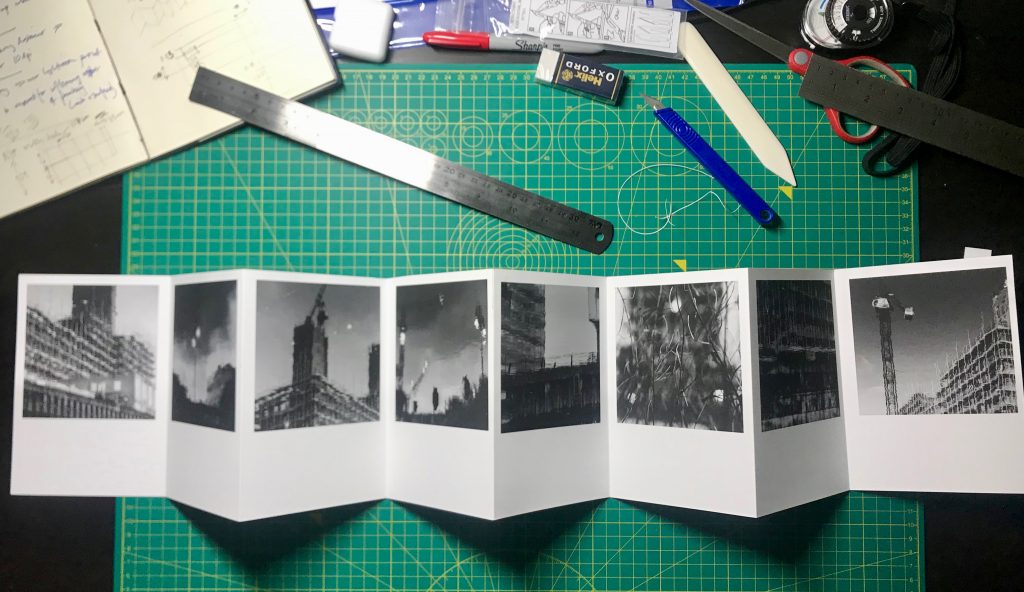
There is work to be done on how they would be used in display, and how different angles of view and light can be used creatively (and, consequently, how images are sequenced and arranged). Some kind of clip that holds each fold at 90 degrees would be helpful (I saw something like this used at Paris Photo last year). The next step is to explore other formats for books/displays and other sequences of images.
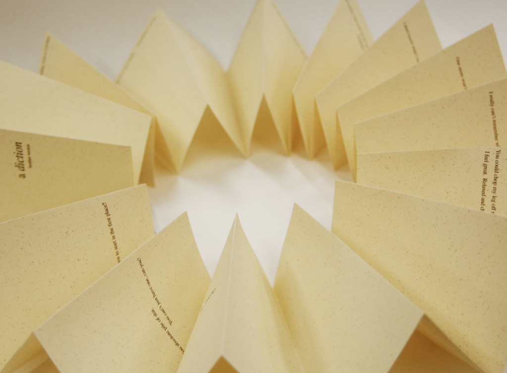
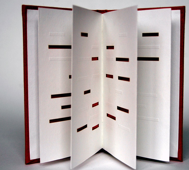
I have been looking at work by Heather Weston, a book artist who explores ways in which established book forms can be used creatively to produce resonances, and tensions, between form and content, for instance in her works a diction (2004) in which the pages are the shape of a pint glass, and unfold into a circle, READ (past, tense) (2000) which is printed with heat sensitive ink that responds to the touch of the reader and Paper Cut: relief (2007) dealing with self harm and taking the form of an accordion book with cut outs (below).
In Bookcraft (2008), she refers to Karen Hanmer’s Destination Moon (2003) which takes the form of a ‘flag book’ (a kind of accordion book) that juxtaposes archival photographs of the Apollo Manned Space Programme with John F. Kennedy’s “Man on the Moon by the end of the decade” speech and a whimsical song about a romantic journey to the moon.
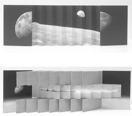
This dynamic handmade book form, which has been produced using an inkjet printer, is well suited to the forms of juxtaposition and change that I am exploring in my own work, and warrants some exploration.
As a foonote, the black and white images above are all reflections of developments along the River Roding taken from the same place as this 1832 drawing of Barking town (the vantage point is now a supermarket car park).
References
Weston, H. 2008. Bookcraft. London: Quarto.