[With apologies to Hito Steyerl].
Interesting presentation from Sam Laughlin on 10th April. Although the focus of Sam’s work is predominantly rural, he is exploring a number of issues that overlap with my own work, which is predominantly urban. In relation to Informing Contexts, he provided a particularly strong rationale for his work, and related his objectives very clearly to his way of working, the forms of images produced and how these are displayed.
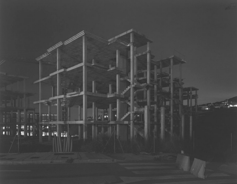
Frameworks explores the essence of a building, before it becomes architectural space. A clear set of criteria guide the selection of sites (with extensive location scouting), and a firm set of operating principles guide the production of the image (working at night, large format camera, small aperture, long exposure) and the ultimate aesthetic form (a ruin in reverse, transparency, the sense of an Escher print, the suggestion of an object). The ‘greyness’ of the image forces the viewer to explore every part of the frame, with no colour, high contrast or strong lines to guide the eye. In many ways, this reflects a concern about my own recent images, which I now see as a strength. There is a need to search, but this turns up unexpected interactions and artefacts.
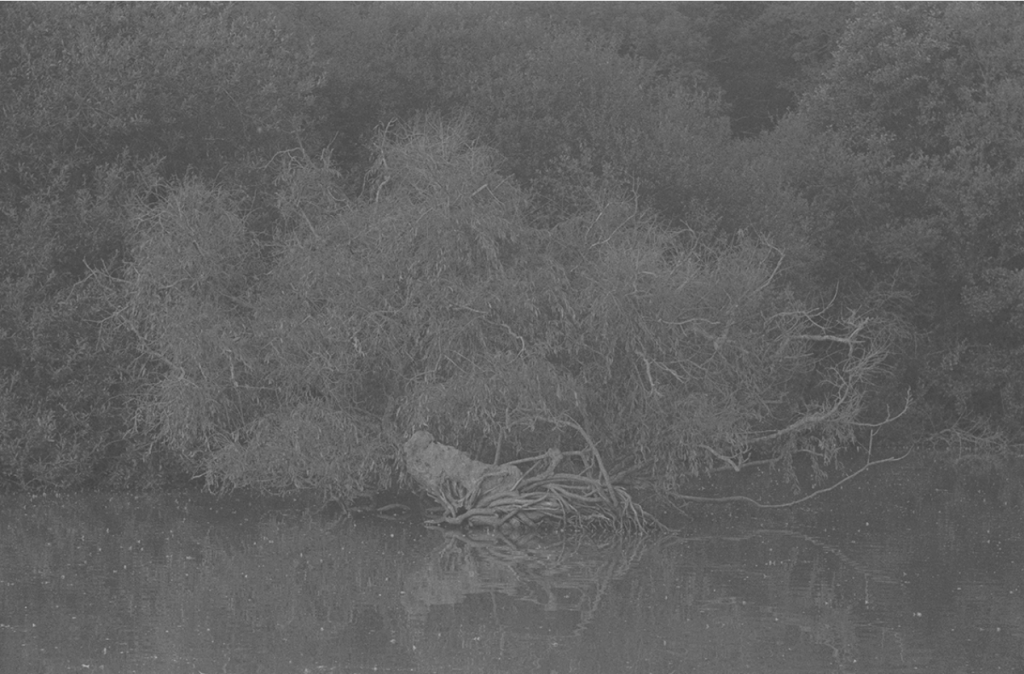
The same aesthetic is evident in Laughlin’s subsequent work, which focuses on natural cycles (nutrients, water). These images have even less structure, and the subject in some cases is difficult to discern. This places an emphasis on the process even more on the suggestion of subject. Laughlin has thought carefully about how this work is exhibited, displaying print directly on the wall without glass (so as to engage the viewer directly with the work without the distraction of reflections or frame) and using print size, scale and placement, and juxtaposition with objects and artefacts to guide and provoke (but not direct) engagement. The work is clearly not made for online viewing, and this raises questions about how best to promote the work and cultivate an audience.
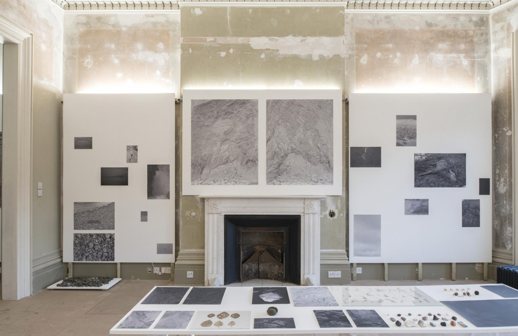
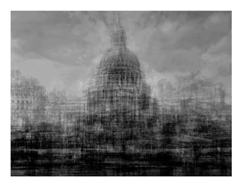
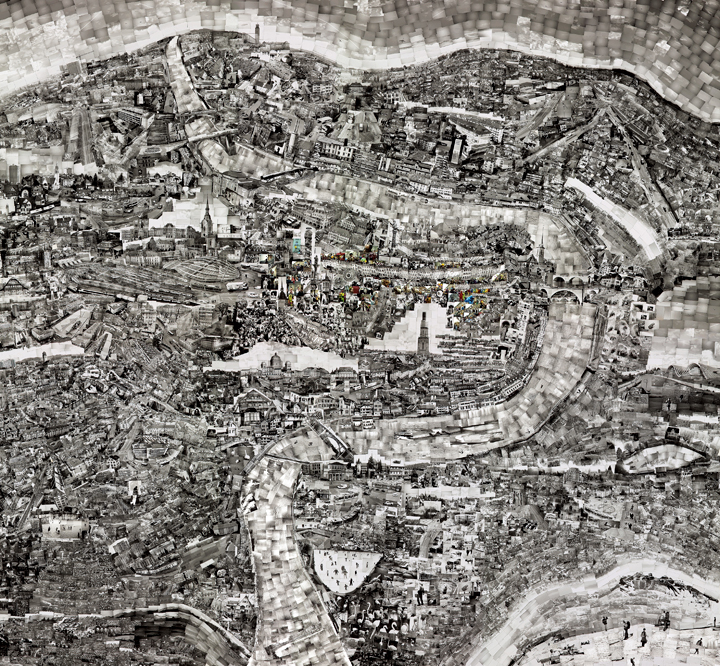
I wasn’t expecting to be working in black and white (though the rationale for this is now clear) nor to be producing such complex images (likewise). It is clearly the least graphic (and therefore the ‘greyest’) images that work best. There are similarities with images produced by Idris Khan and Sohei Nashino in tonality and complexity, and absence of visual guidance for the view (but both do provide points of reference given the emphasis on a specific place, albeit at different scales, and different form of composite image making). A clear issue for me, in developing this work, is how best to circulate and display the images.
